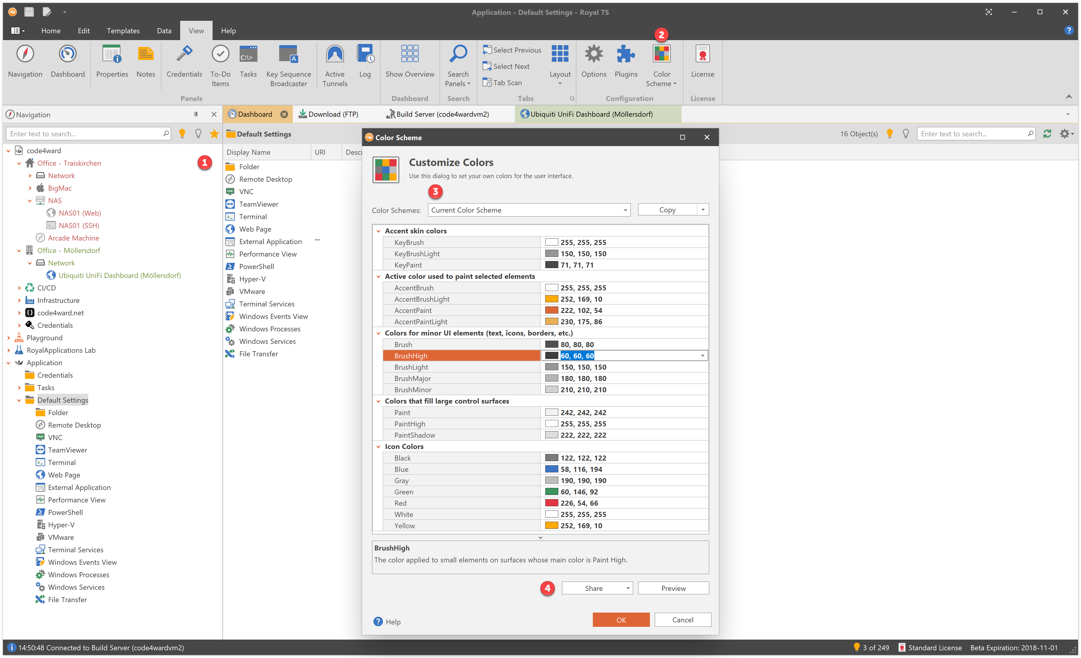
A couple of weeks ago we released the beta of Version 5 of Royal TS for Windows. In this blog post we want to introduce a couple of things we changed in the user interface. We are still tweaking and optimizing V5, so there’s a good chance that some of the things might change or look a bit different.
1. General User Interface Changes
A “lighter” User Interface
As you can see in the screenshot above, Royal TS V5 now looks a bit “lighter”. If you look at the Navigation panel header, the tab header and even the split-line between the Navigation panel and the Dashboard tab, you will notice thinner lines and a more compact, flatter layout.
SVG Icons
We also made a huge effort to update all the icons we use in the user interface (even those coming from the plugins). All icons are now SVG based which means they are now vector based and not pixel based anymore. Back in V3 and V4 we needed 11 different pixel based images for each icon and use the appropriate size, depending on the DPI setting on Windows. This was already a huge improvement and made look Royal TS’ icons crisp and sharp even if you set your DPI setting to 200% (192 DPI) but it was also very hard to maintain. Every time we had to add a new icon or change an icon, we had to generate all the 11 variants of sizes up to 256×256 pixels.
In V5, all icons are now vector based SVG icons and will be scaled automatically based on the DPI setting. This also means that scaling up your display to 300 or more percent, will be no problem and all the icons will still look great!
There are no more “Skins”
Royal TS V2 up to V4 allowed you to switch to different skins and some skins also had different color schemes. Different skins also meant different styles and a dedicated “look-and-feel” for each skin. There were all sorts of skins available (like Office or Visual Studio inspired skins) but the reality was that depending on the skin we had to tweak a lot of our UI. This was a maintenance nightmare. We decided to drop the skins feature because most of the skins had one major flaw: most skins were pixel based which means that even when our icons look great, the rest of the UI does not. We decided to focus our efforts to the vector based skin and made sure Royal TS is ready to run on the high resolutions screens which are getting more and more affordable.
2. Introducing Color Schemes
On the View ribbon tab, there’s a new drop down button called “Color Schemes” with 4 built-in schemes: Default, Light, Dark and Black. This is pretty much what Microsoft Office, Visual Studio, and many other apps are offering nowadays. The Default scheme is the one you see in the above screenshot. This might change as we plan to still do some tweaking or maybe do a competition to let users submit color schemes we consider as our default scheme.
3. Custom Color Scheme
Now it gets interesting! Clicking “Custom…” in the Color Schemes dropdown shows the dialog you see above in the screenshot. Here are a couple of interesting things:
- The drop down at the top allows you to choose from many, many pre-defined color schemes right out of the box. Once you selected the color scheme, hit the “Copy” button to copy all the color values from the selected scheme to the property grid. This way, you can quickly get started with a predefined scheme and tweak the colors as you wish.
- Clicking on a color will show a short description at the bottom where this particular color will be used.
- There are also “Icon Colors” available. Tweaking these colors allows you to set the colors used by all the icons in the UI. This way you can make sure that a black color in a black skin still has enough contrast to look great.
- To get a better feel for the scheme, hit the Preview button to see how your current color scheme will look like.
In our usage statistics we see that roughly 10% of our beta users are going for a custom color scheme. That’s really impressive because we didn’t announce this feature yet.
4. Share your Color Schemes
The “Share” button allows you to share your color scheme with other users. We create a special link which instructs your browser to open Royal TS’ Color Scheme editor and set the color scheme for you to try. Click this link to try it. In case you have an older version of Royal TS installed after you installed the newer one, your browser might open the older version which doesn’t support color schemes. In this case you can still just copy the link into the clipboard and use the Copy drop down button to apply the colors to the property grid.
That’s it for now. We really hope that the updated look and feel is appealing to all of you. We also hope that the color customization options are a welcome addition. Please let us know what you think about these changes and if you like them or not.
To download the Royal TS V5 beta, follow this link.

