Royal TS V3 beta is almost feature complete and the feedback in our forums is overwhelming! There are many great discussions and a lot of constructive feedback coming in.
After some more weeks of hard work, I decided to give you an update on what we’ve been working on and what’s in it for you. Don’t forget to check out Part 1 and all the other great blog posts about our brand new product Royal Server!
The many little things
In each beta release we do some more fine tuning and improve some little things here and there. Here’s a short list of notable improvements and settings:
-
View -> Options -> User Interface -> General: Allow Animations In V3 we “modernized” the UI and provided also “Office-style” animations and transitions in some places. In case those animations are annoying you, you can un-check Allow Animations to disable them.
-
View -> Options -> User Interface -> Tabs: Enable Taskbar Thumbnails Also new, and enabled by default, tab thumbnails for each opened tab or window in the Taskbar – similar to Internet Explorer or many other tab based applications. This option allows you to revert back to the same behavior as in V2.
-
View -> Options -> User Interface -> Navigation | Lists: Enable Pixel-Scrolling The tree and the lists (used in the dashboards and management connection types) support smooth pixel scrolling. You disable this behavior for the navigation tree and for all lists.
-
View -> Options -> (Mouse) Events -> Tracking: Keep remotely disconnected tabs open This setting was recently moved to this page as it makes more sense here. In addition we improved this particular feature when used with Ad Hoc connections. If enabled, Ad Hoc connections will not be removed and can be reconnected if it was disconnected remotely. We will probably rename this page to just “Events“.
-
Smart and visual password strength indicator and password generator We have a dedicated blog post about that here but I thought I should mention it here as well.
-
Improved update notification and automatic installation of updates A very popular improvement for many users. We blogged about that a while back here.
-
Expanding and collapsing all contained folders in the Navigation tree Some users already noticed that one icon is missing to quickly expand and collapse all the folders in the Navigation tree. The toolbar icon wasn’t really elegant but inspired from the OS X default behavior we found a nice solution. Hold down the Shift-key while you expand a folder to also expand all the subfolders. Holding down the Shift-key while collapsing a folder, all the folders on the same level are collapsed as well. If you do this on one of the document nodes, all documents are collapsed.
-
Change the order of the documents (even in the Autostart document list) You can now change the order of the document by clicking the Move Up or Move Down command on the Edit ribbon tab. The Application document will still be the very last document but all the other documents can be re-arranged. The Autostart document list editor now also features a Move Up and Move Down command to control in which order those documents are opened.
Enough of boring lists now. It’s screenshot time!
External Tab Group and Context Menu
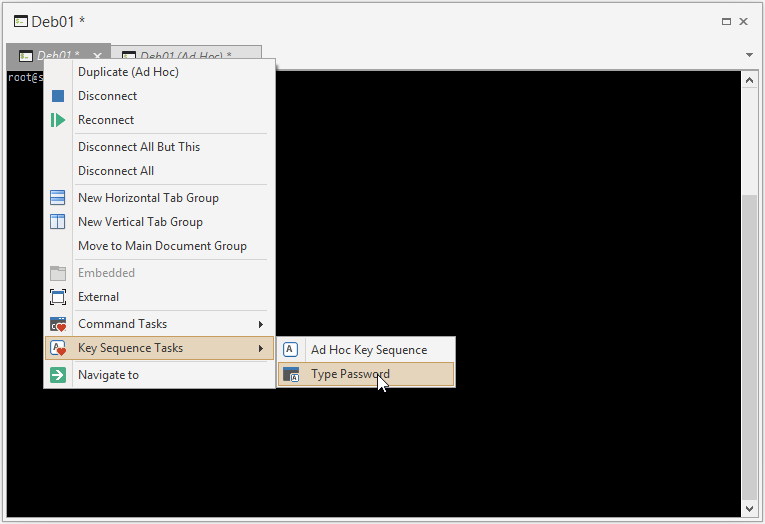
As mentioned at the end of Part 1, you can now arrange multiple tabs in an external window – and even split the group into multiple views. Since the external window (which is hosting the tab) does not have a ribbon or toolbar, we extended the context menu for tabs to provide quick and easy access to your favorite command and key sequence tasks:
Also note the last menu item “Navigate to”. Users who configured Royal TS to not track tab selection changes in the Navigation tree will love this one. It will select and scroll to the corresponding entry in the Navigation tree.
List based Dashboards and Connections
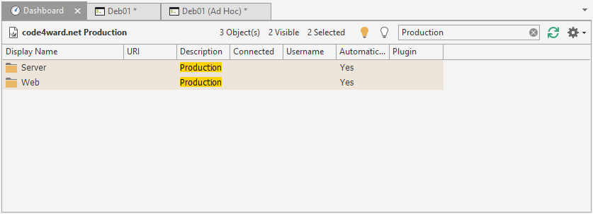
We worked hard to streamline and align the look and feel as well as the user experience in many places. Here’s an example of the dashboard showing the content of a selected folder/document with a filter:
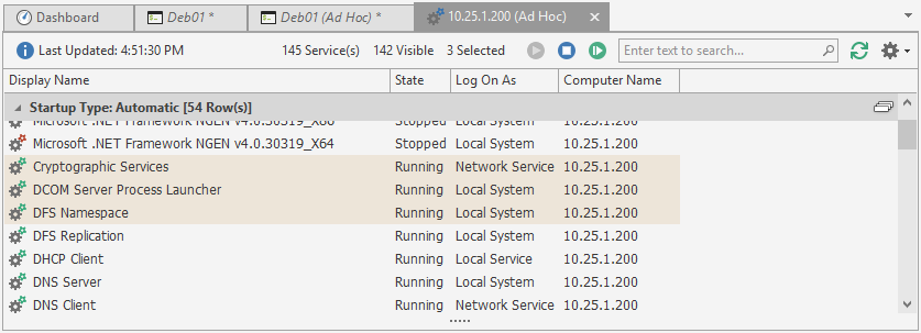
Here’s an example of a Windows Services management connection with grouping:
On the very left, Dashboards will show the name of the currently selected item. Whenever it makes sense, we show some information about the list content and the current selection. Going right, you will see buttons for commands (if available) and a search box (which can be focused using CTRL + F). Further, you will see a Refresh button and a drop down menu for Options like grouping, filtering, etc.
Improved Terminal Dashboard
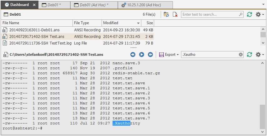
Another example where you will find the very same concept is the new and improved Terminal dashboard:
The first thing to mention here is that the dashboard will initially always show the text representation of the ANSI recording or log file as soon as it is selected. You can still play back the recording using the Play button on the content toolbar. As before you can also export the selection to various formats.
Also new is the ability to search the list of files and also search the content of the log file.
Ad Hoc Protocol Identifier Support
Last but not least, we also improved a lot around Ad Hoc connections. You can now use protocol identifiers to quickly connect to the correct connection type:
A detailed list of supported identifiers can be found here. You can still use and combine this with the credential picker as before. Another thing to mention is that when you do not specify a protocol identifier, the drop-down menu with the connection types and templates is shown as soon as you hit the Enter key.
As you can see, a lot is going on and we still have some “bigger” features ahead. Stay tuned…


